Семь ошибок в дизайне логотипа

| Эта статья для тех, кто заказывает логотип и не знает, как оценить качество его дизайна. Сейчас мы расскажем про семь самых распространенных ошибок. Если в готовом лого больше двух из них, лучше переделать все заново. |
Ошибка № 1. Композиция
Неудачные композиции видны даже непрофессионалам. Асимметрия, слишком близко или далеко расположенные элементы и заваливающиеся части логотипа заметны сразу.
Одна из частых композиционных ошибок — неправильное расположение элементов.
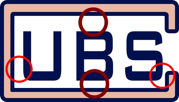
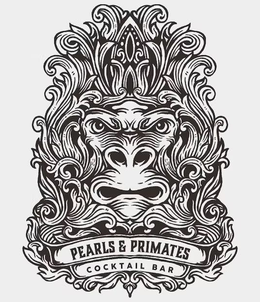
Логотип компании ЮБС
Ошибка № 2. Цвета
Проблемы с цветами в логотипах возникают по разным причинам: из-за слишком сильной либо чересчур слабой контрастности, насыщенности или несочетающихся оттенков.
Ниже перечислены основные ошибки, связанные с цветами.
Слишком большое количество цветов в логотипе
Подробнее про подбор цветов написано в статье «Как выбрать цвет логотипа».
Неудачные цветовые сочетания
При создании логотипа, в котором есть несколько цветов, есть смысл воспользоваться цветовой палитрой — это специальная схема, где подобраны оттенки, хорошо сочетающиеся друг с другом.
Еще один инструмент для поиска идеально подходящих цветов — Николай Иронов. Он запрограммирован находить бесконечное количество удачных цветовых сочетаний с помощью математических расчетов.
Ошибка № 3. Ретростиль
Старомодные логотипы вредят бизнесу, потому что из-за них кажется, будто и сама компания устарела. Поэтому дизайн надо вовремя обновлять.
Рассмотрим основные признаки старомодности на сегодня.
Грязные тени

Избыточный глянец

Ошибка № 4. Сверхмодный стиль
С модными логотипами другая проблема: их делают все. Например, когда-то на пике популярности были черно-белые текстовые логотипы. В это время крупные бренды одежды одновременно обновили дизайн, и их логотипы стали похожи друг на друга.

Ошибка № 5. Большое количество деталей
Логотипы, перегруженные деталями, плохо выглядят в мелких форматах: на аватарках в соцсетях, на визитках, ручках и бланках. Они классно смотрятся только в большом формате, но так логотипы используют редко.
|
|
|
В большом размере детали различимы |
В маленьком размере ничего не видно |

Ошибка № 6. Двусмысленность
Никогда не мешает проверить, не воспринимается ли логотип двояко. Для этого достаточно показать его нескольким знакомым, не принимавшим участия в создании.
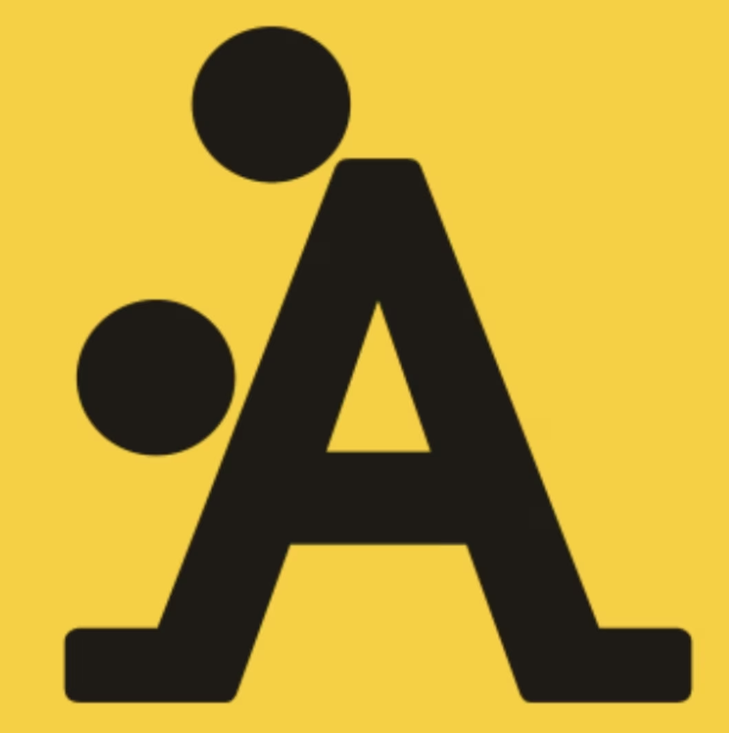
Этот этап лучше не пропускать, иначе может возникнуть неловкость. Например, логотипы брендовой одежды «А-стайл» и Американского центра педиатрии вызывают немало вопросов, поскольку многие люди видят в них не любовь к спорту и детям, а что-то другое.
|
|
|
Логотип брендовой одежды «А-стайл» |
Логотип Американского центра педиатрии |

Ошибка № 7. Шаблонные образы
Хорошо, когда по логотипу сразу понятно, чем занимается компания. Но плохо, если этот образ настолько распространен, что встречается у каждого первого конкурента. Лучше не использовать в логотипе очевидные символы.
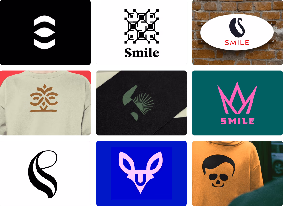
Самые необычные образы для логотипов придумывает Николай Иронов. Это искусственный дизайнерский интеллект, который мыслит более свободно, чем люди, и находит самые нетривиальные решения.
Вот какие логотипы Иронов придумал для стоматологии «Смайл».
 |
Заказать логотип у Иронова.
 Как защитить логотип? Разбираемся в вопросах авторского права и регистрации товарного знака
  Что делать, если ваш логотип не работает? Анализируем и исправляем ошибки
  Целевая аудитория: ключ к успешному брендингу и продажам